Monday, February 27, 2006
Toronto back alleys pt 3
Another quick sketch of downtown toronto back alleys from my files. This one's in pen and ink and of a day time scene, for a change.
Sunday, February 26, 2006
The Hard Way to Make a Window Display
My favourite bookstore in Toronto is Pages Books and Magazines on Queen Street. Several years ago, when I was starting out as an illustrator, the owner of Pages, Marc Glassman, took pity on me and let me design his in-store signs. Since then, I've also done the occasional window display for them, usually to promote store events. During the month of January this year, I got the chance to do another window display, this time to promote something a little more personal.
It all began with my friend and fellow toronto cartoonist Brian Mclachlan who suggested we do a display to promote his graphic novel and my children's book at the same time. Since both dealt with "media literacy" and "culture-jamming" (gawd -- I hate that term: it's so 90's), we thought we could do a collaborative display on the theme of "corporate media" vs. "street media". Sounds arty, I know, but bear with me. To keep things simple and stress-free, it was decided that Brian would do most of the "writing" (concepts, jokes, slogans) and I would do most of the "drawing" (style, composition, figure designs).
With that in mind, and after brainstorming with Brian, I drew up my first colour thumbnail sketch, which presented a street scene split in 2 down the centre: 1 side for each window. The left would represent "street media", while the right would represent "corporate media", with mixed figures shown moving between both realms:
After Brian saw the thumbnail, he wrote out his suggestions and ideas for all the blank spots I had left and sent me this:
I then drew up a tighter linear rough incorporating Brian's suggestions and changes:
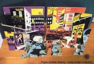
Then, using the linear rough as a guide, and because I am a totally obsessive nut, I built a scale model maquette of all the various pieces that made up the proposed display. It was made with bristol board and gouache paint over the course of an afternoon. I think this was probably the easiest part of the whole experience:
Of course, things don't ever go that smoothly, and after checking, Brian and I realized our measurements were quite off. It turns out the actual display area is quite a bit shorter than the window area. Hence, I needed to revise the display to add more room to both sides. A new linear rough was drawn with the proper dimensions and incorporating more figures and elements to fill up the space:
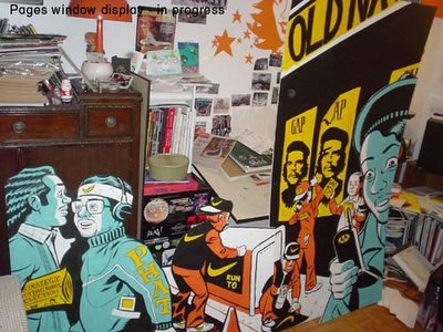
Finally, with the drawing and measurements set, we got down to the tedious task of actually painting all the pieces that made up the display. For some obscure reason, we decided to do most of it at Brian's studio, so we spent a few days over the christmas holidays listening to mash-up tunes (Brian has an awesome collection of mash-ups!) and eating take-out while painting in very very close proximity, A real gentleman, he graciously consented to trying to paint in my "style" to make the collaboration go smoother. We broke it down so that Brian handled most of the backgrounds and all the lettering, while I did the foreground figures and the "finesse-y" bits and touch ups:
When all the pieces were ready, we moved the completed display into Pages Bookstore and installed it over the course of a short afternoon. Here is the installed view:
And that's what I did over the Christmas holidays!
It all began with my friend and fellow toronto cartoonist Brian Mclachlan who suggested we do a display to promote his graphic novel and my children's book at the same time. Since both dealt with "media literacy" and "culture-jamming" (gawd -- I hate that term: it's so 90's), we thought we could do a collaborative display on the theme of "corporate media" vs. "street media". Sounds arty, I know, but bear with me. To keep things simple and stress-free, it was decided that Brian would do most of the "writing" (concepts, jokes, slogans) and I would do most of the "drawing" (style, composition, figure designs).
With that in mind, and after brainstorming with Brian, I drew up my first colour thumbnail sketch, which presented a street scene split in 2 down the centre: 1 side for each window. The left would represent "street media", while the right would represent "corporate media", with mixed figures shown moving between both realms:
After Brian saw the thumbnail, he wrote out his suggestions and ideas for all the blank spots I had left and sent me this:
I then drew up a tighter linear rough incorporating Brian's suggestions and changes:
Then, using the linear rough as a guide, and because I am a totally obsessive nut, I built a scale model maquette of all the various pieces that made up the proposed display. It was made with bristol board and gouache paint over the course of an afternoon. I think this was probably the easiest part of the whole experience:
Of course, things don't ever go that smoothly, and after checking, Brian and I realized our measurements were quite off. It turns out the actual display area is quite a bit shorter than the window area. Hence, I needed to revise the display to add more room to both sides. A new linear rough was drawn with the proper dimensions and incorporating more figures and elements to fill up the space:
Finally, with the drawing and measurements set, we got down to the tedious task of actually painting all the pieces that made up the display. For some obscure reason, we decided to do most of it at Brian's studio, so we spent a few days over the christmas holidays listening to mash-up tunes (Brian has an awesome collection of mash-ups!) and eating take-out while painting in very very close proximity, A real gentleman, he graciously consented to trying to paint in my "style" to make the collaboration go smoother. We broke it down so that Brian handled most of the backgrounds and all the lettering, while I did the foreground figures and the "finesse-y" bits and touch ups:
When all the pieces were ready, we moved the completed display into Pages Bookstore and installed it over the course of a short afternoon. Here is the installed view:
And that's what I did over the Christmas holidays!
Friday, February 24, 2006
Work Work Work pt. 3
Wednesday, February 22, 2006
Lean To Draw!
Here's one that was drawn for fun. It actually began as a doodle that got out of control. I took the copy and layout pretty much verbatim from an old black and white ad, but just substituted my own images and and made some minor changes to the text. Then I rendered the whole thing out in 2 colours. Blame me if you want for all the crappy lettering and crooked lines, but remember: I did this without a ruler!
I have Claudia to thank for scanning this and cleaning it up. It was drawn entirely with PITT markers and brush-pens (my #1 doodling choice) so it took some tidying. She also added all the cool folds and fake paper effects to give it that extra cheesy look like something you'd find in the back of an ancient men's magazine -- one with a name like "Juggs and Jiggles!" or "Sunbathers Monthly".
Saturday, February 18, 2006
Motels
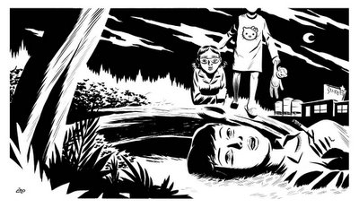
Another b&w drawing from my files -- this one was used as the cover for a small run sketchbook zine I put out (real small, like under 200 copies) in time for the 2005 Toronto Comic Arts Festival. I like drawing pictures involving motels, especially at night. For whatever reason, its a theme I come back to often.
Friday, February 17, 2006
Comics are For Kids Pt. 3
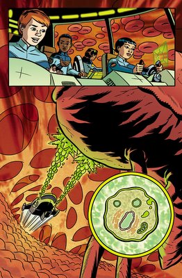
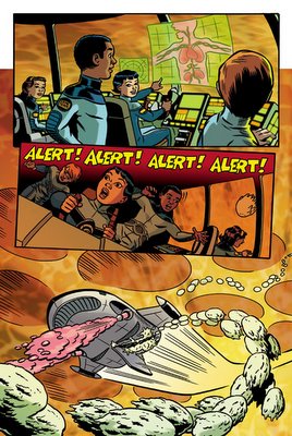
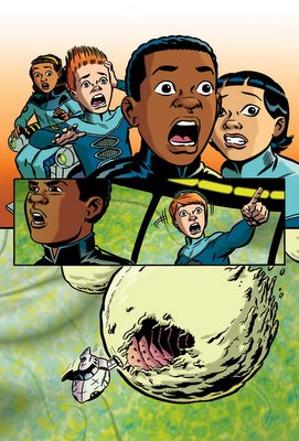
I featured the cover for this job a few posts ago, but here are some pages from a recent children's educational comic assignment that I just completed drawing. It stars a team of teens who fly a futuristic "shrink-ship" into a sick patient's bloodstream (ala the movie "Fantastic Voyage" and many other homages) to heal a diseased liver and also to teach readers about cells, gene therapy, the cirulatory system and a few other facts about biology and science.
I had a lot fun on this assignment as it featured an opportunity for me to draw some pretty imaginative scenes and backgrounds -- I mean, just what does the inside of the lymphatic system look like? I had to research it and then try and make it look cool and visually interesting for young readers. The colouring on this one is also a little slicker and more "photoshop-y" than I usually like to go, but I thought it was fitting with the sci-fi futuristic theme.
Friday, February 10, 2006
Comics are for Kids! (part 2)
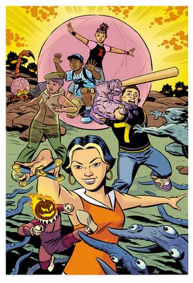
Here are 2 cover images, drawn last year. These were drawn for a couple of proposed graphic novels to be written by talented toronto writer/cartoonist Brian Mclachlan. If you haven't already seen his work, you can check out the link to his wickedly hilarious strip the Princess Planet to get an idea of his dementia, er, genius.
Anyway, we were trying to come up with some ideas for self-contained graphic novels aimed at younger readers. Brian came up with all the concepts, characters and storylines and I drew up these sample covers to help pitch the idea. Unfortunately, nothing came of it, as the pitches seemed to get lost in the shuffle of both our packed schedules. Still, I thought it'd be fun to post these here. I'll leave it to you to determine what's going on in the drawings...or perhaps Brian will post an explanation himself...?
Tuesday, February 07, 2006
Work Work Work pt. 2
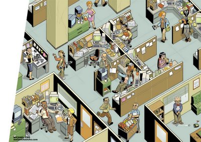
I've been so busy with freelance work lately that I haven't had time to draw any sketches at all! So I thought I'd post some work-related images. These are all illustrations of various offices/work-places I drew a while ago for the very nice children's book Media Madness. Written by Dominic Ali and published by Kids Can Press, its a media literacy primer for kids and tries to inform them about how media is made and how it works. You can read more about it here.
Incidentally, yes that IS my studio in the first illustration, and yes, it is that cluttered. But I've gotten rid of the pizza boxes.