Wednesday, March 15, 2006
back to the shore...
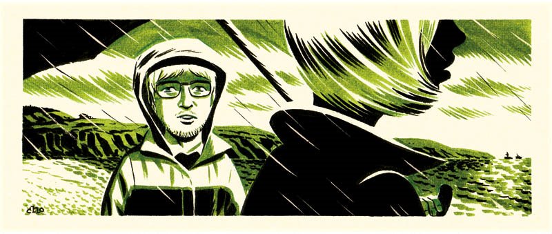
Another two-colour drawing, done in markers on watercolour paper. This one was drawn late at night, after working on other assignments.
Newer Post
Older Post
Home