
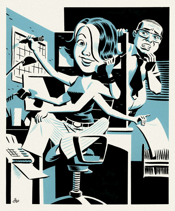
Well, I'm still very busy drawing some new comic pages, so I'm posting another image from my files. This one's a spot illustration I did last year for Canadian Business Magazine, and I thought I'd share it because its a good example of the kind of editorial work I do. Unlike many of my recent pieces, this one was painted old-school style in gouache.
BTW, I think I've drawn several variations on the "multi-armed, multi-tasking worker" in my career and I don't think I'm the only illustrator who has done so -- it seems to be a visual concept that comes up again and again. For further proof, check out the example by my friend and fellow artist, Ramon Perez, on his blog.
7 comments:
I really like how you handled the shoulder joint, that section always drives me crazy when I draw animals/humaniods with multiple arms.
It may be true that the multi-armed approach has been done before, but I enjoy the choices you've made in the illustration -- a contemporary young person, legs folded underneath her and smiling, and a boss (who doesn't know how to tie his tie) gaping in astonishment at how effortless she's making it all look.
Ah, if only she was being paid what she was worth . . .
And besides, I like the clean lines and the "duotone style". It's not overworked or over-rendered, and pleases the eye while communicating the core idea quickly.
Nicely done, as always, Mike!
Best,
Rich
www.thinkinkstudios.com
http://richfaber.blogspot.com
Very nice. Nice overall feel.
Amazing as always, Mike. I love your impeccable use of contrast in this one.
When ever we're in Pages bookstore, we always enjoy your signs as much as the books. Love your gouache work! Well done.
This thing is AMAZING! I LOVE it.
Post a Comment