Monday, February 27, 2006

Toronto back alleys pt 3


Another quick sketch of downtown toronto back alleys from my files. This one's in pen and ink and of a day time scene, for a change.

Sunday, February 26, 2006

The Hard Way to Make a Window Display

My favourite bookstore in Toronto is Pages Books and Magazines on Queen Street. Several years ago, when I was starting out as an illustrator, the owner of Pages, Marc Glassman, took pity on me and let me design his in-store signs. Since then, I've also done the occasional window display for them, usually to promote store events. During the month of January this year, I got the chance to do another window display, this time to promote something a little more personal.

It all began with my friend and fellow toronto cartoonist Brian Mclachlan who suggested we do a display to promote his graphic novel and my 
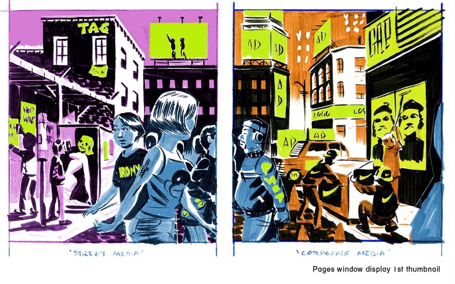
children's book at the same time. Since both dealt with "media literacy" and "culture-jamming" (gawd -- I hate that term: it's so 90's), we thought we could do a collaborative display on the theme of "corporate media" vs. "street media". Sounds arty, I know, but bear with me. To keep things simple and stress-free, it was decided that Brian would do most of the "writing" (concepts, jokes, slogans) and I would do most of the "drawing" (style, composition, figure designs).

With that in mind, and after brainstorming with Brian, I drew up my first colour thumbnail sketch, which presented a street scene split in 2 down the centre: 1 side for each window. The left would represent "street media", while the right would represent "corporate media", with mixed figures shown moving between both realms:


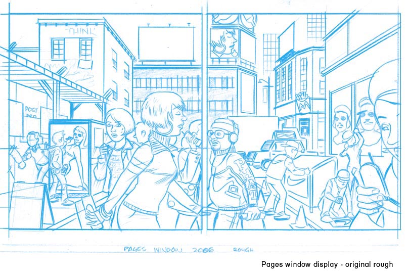
After Brian saw the thumbnail, he wrote out his suggestions and ideas for all the blank spots I had left and sent me this:


I then drew up a tighter linear rough incorporating Brian's suggestions and changes:


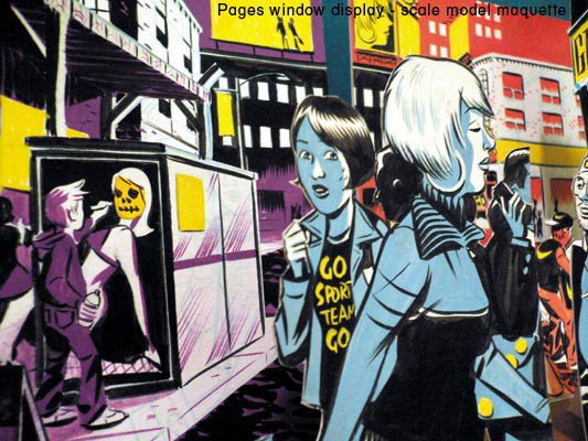
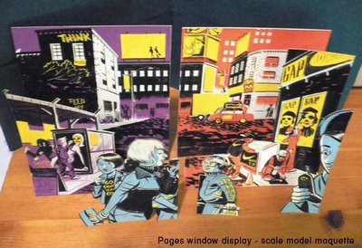
Then, using the linear rough as a guide, and because I am a totally obsessive nut, I built a scale model maquette of all the various pieces that made up the proposed display. It was made with bristol board and gouache paint over the course of an afternoon. I think this was probably the easiest part of the whole experience:


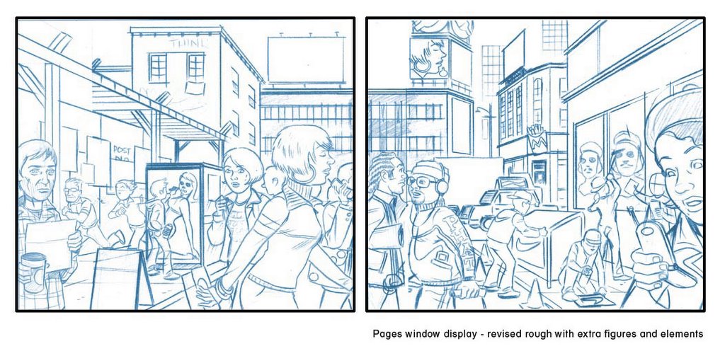
Of course, things don't ever go that smoothly, and after checking, Brian and I realized our measurements were quite off. It turns out the actual display area is quite a bit shorter than the window area. Hence, I needed to revise the display to add more room to both sides. A new linear rough was drawn with the proper dimensions and incorporating more figures and elements to fill up the space:


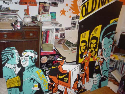
Finally, with the drawing and measurements set, we got down to the tedious task of actually painting all the pieces that made up the display. For some obscure reason, we decided to do most of it at Brian's studio, so we spent a few days over the christmas holidays listening to mash-up tunes (Brian has an awesome collection of mash-ups!) and eating take-out while painting in very very close proximity, A real gentleman, he graciously consented to trying to paint in my "style" to make the collaboration go smoother. We broke it down so that Brian handled most of the backgrounds and all the lettering, while I did the foreground figures and the "finesse-y" bits and touch ups:


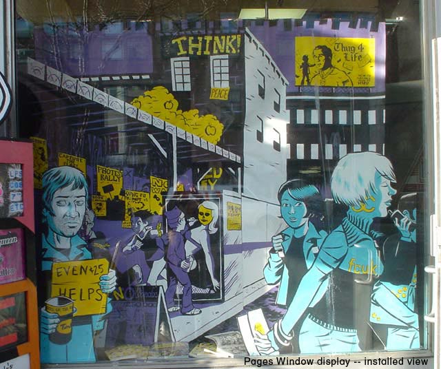
When all the pieces were ready, we moved the completed display into Pages Bookstore and installed it over the course of a short afternoon. Here is the installed view:


And that's what I did over the Christmas holidays!

Friday, February 24, 2006

Work Work Work pt. 3


And here's a sketch from my files, but newly coloured and posted to this blog. It kind of sums up my thinking at times about freelance life, but perhaps you might find it applicable to your own circumstances...

Wednesday, February 22, 2006

Lean To Draw!


Here's one that was drawn for fun. It actually began as a doodle that got out of control. I took the copy and layout pretty much verbatim from an old black and white ad, but just substituted my own images and and made some minor changes to the text. Then I rendered the whole thing out in 2 colours. Blame me if you want for all the crappy lettering and crooked lines, but remember: I did this without a ruler!

I have Claudia to thank for scanning this and cleaning it up. It was drawn entirely with PITT markers and brush-pens (my #1 doodling choice) so it took some tidying. She also added all the cool folds and fake paper effects to give it that extra cheesy look like something you'd find in the back of an ancient men's magazine -- one with a name like "Juggs and Jiggles!" or "Sunbathers Monthly".

Saturday, February 18, 2006

Motels


Another b&w drawing from my files -- this one was used as the cover for a small run sketchbook zine I put out (real small, like under 200 copies) in time for the 2005 Toronto Comic Arts Festival. I like drawing pictures involving motels, especially at night. For whatever reason, its a theme I come back to often.

Friday, February 17, 2006

Comics are For Kids Pt. 3

I featured the cover for this job a few posts ago, but here are some pages from a recent children's educational comic assignment that I just completed drawing. It stars a team of teens who fly a futuristic "shrink-ship" into a sick patient's bloodstream (ala the movie "Fantastic Voyage" and many other homages) to heal a diseased liver and also to teach readers about cells, gene therapy, the cirulatory system and a few other facts about biology and science.

I had a lot fun on this assignment as it featured an opportunity for me to draw some pretty imaginative scenes and backgrounds -- I mean, just what does the inside of the lymphatic system look like? I had to research it and then try and make it look cool and visually interesting for young readers. The colouring on this one is also a little slicker and more "photoshop-y" than I usually like to go, but I thought it was fitting with the sci-fi futuristic theme.


Friday, February 10, 2006

Comics are for Kids! (part 2)


Here are 2 cover images, drawn last year. These were drawn for a couple of proposed graphic novels to be written by talented toronto writer/cartoonist Brian Mclachlan. If you haven't already seen his work, you can check out the link to his wickedly hilarious strip the Princess Planet to get an idea of his dementia, er, genius.

Anyway, we were trying to come up with some ideas for self-contained graphic novels aimed at younger readers. Brian came up with all the concepts, characters and storylines and I drew up these sample covers to help pitch the idea. Unfortunately, nothing came of it, as the pitches seemed to get lost in the shuffle of both our packed schedules. Still, I thought it'd be fun to post these here. I'll leave it to you to determine what's going on in the drawings...or perhaps Brian will post an explanation himself...?

Tuesday, February 07, 2006

Work Work Work pt. 2


I've been so busy with freelance work lately that I haven't had time to draw any sketches at all! So I thought I'd post some work-related images. These are all illustrations of various offices/work-places I drew a while ago for the very nice children's book Media Madness. Written by Dominic Ali and published by Kids Can Press, its a media literacy primer for kids and tries to inform them about how media is made and how it works. You can read more about it here.

Incidentally, yes that IS my studio in the first illustration, and yes, it is that cluttered. But I've gotten rid of the pizza boxes.

Tuesday, January 31, 2006

Edvard Munch

Allow me to get a little arty here. I've been a fan of Edvard Munch's work since I was a teen. There are many paintings and prints of his that are forever stored in my memory. Some of them are so powerful, they're almost like totems or something to me and I find myself occasionally doing my own variations on some of his works, trying to get to the heart of their meaning for me. I am in no way comparing myself to Munch, of course, I'm just saying that I, like countless other illustrators, like to riff on some of his ideas and images... I just never do variations on "The Scream". That would be pure hackery.

Sometimes, the Munch influence is deliberate, sometimes it's unconscious and I only discover it later, after I've finished a drawing. Below are a couple of drawings influenced by two of my favourite Munch images.


In the first case, I was actually thinking about the Munch image "2 people: the Lonely Ones" and was trying to remember it as as I was drawing this piece.


In the 2nd case, I wasn't actually thinking about the Munch painting "Amore And Psyche". The influence was purely subconscious and I only realized it months after I drew it.

Saturday, January 28, 2006

Kensington Market


Just a quick marker sketch of Kensington market in downtown Toronto. Guess who's in the foreground...

Wednesday, January 25, 2006

Comics are for Kids!


I'm a firm believer in the value of comics as a way to teach literacy to young children. I know reading comic books helped me to learn english when I was just a 6 year old boy and new to the country. In the last couple of years, I've seen a dramatic increase in interest and attention paid to comics by children's publishers. Many of them are seeing the potential of the medium to reach reluctant readers and engage kids who are used to a high degree of stimulation from their media. My good friend Liam O'Donnell has written more about this in his blog, but I think its great. Just from a personal artistic viewpoint, I've always enjoyed and looked for opportunities to draw comics for a young audience but have found that part of the marketplace badly served in the past. I'm really hoping that this new interest in comics by children's publishers will lead to a greater comic readership among kids.

The above two images were recently completed assignments for children's publishers. The first was a cover for a educational comic about genes and cells while the second is the cover for the Jan/Feb episode of "Max Finder Mystery", appearing every month in Owl Magazine.

Tuesday, January 24, 2006

Wednesday, January 18, 2006

a little portrait


Here's an old portrait of me and my lovely and talented wife, Claudia Davila, that I did with markers. I like how I'm all clean-shaven in this one. I drew this years ago, but found it recently while browsing through some files and thought it'd be fun to post. Incidentally, you can check out Claudia's own blog at www.franlife.blogspot.com.

Monday, January 16, 2006

Toronto back alleys pt 2


Another 2am posting, this time more Toronto alley sketches. As I mentioned previously, I like going for night time walks in the summer. And I've always been drawn to that orange street light colour. That glow has a particular emotional quality for me. Orange streetlamps always make me think of empty mall parking lots and back alleys and a kind of teenage lonliness and angst. Maybe I just remember too many nights walking home late and alone and cutting through side streets...

These sketches were drawn in the summer. They were done very small, in ink and brush with some Dr. Martin dyes for the colour.

Thursday, January 12, 2006

old-school pen and ink


Until recently, I never really worked in pen and ink. That is, whenever I drew in black and white, I worked mainly with brushes. I was never a fan of modern cross-hatching styles and was always more interested in artists who drew 1 precise line over 50 little hatched ones. One time a friend of mine who was very good with pen and ink tried to teach me how to use nib-pens and was horrifed to find out I didn't even know how to hold one correctly.

However, a couple of winters ago, I re-discovered the work of some old-school pen and ink masters and I was absolutely floored. I had seen some examples of work by guys like Joseph Clement Coll, Charles Dana Gibson and Franklin Booth years before, but at that time I didn't even understand how the work was done. I thought it was some form of print-making or something. When I saw it again recently, I GOT it. These guys were just incredible artists, and treated pen-and-ink work like oil-painting -- only they just built up their tones using lines not colour. My favourite of the old masters is Orson Lowell, and I discovered his work mostly through the fine "Illustration" magazine put out by Jim Vadeboncoeur. If you like pen-and-ink illustration, especially from it's glory days in the early part of the 20th century, I highly recommend you try and find his work -- its unequalled.

The above sketches are my attempts to play around with pen-and-ink. I don't do much of it, still prefering to use brushes, but I have at least learned to hold a pen correctly. They were all drawn from an issue of "Slam!", an NBA basketball magazine. See if you can guess which players I've messed up the likeness on...

Wednesday, January 11, 2006

Argg, matey!


Just a quick little ink sketch from my sketchbook. I think I had just bought a pile of educational flashcards about pirates at a yardsale for a buck and was reading them at the time. The flashcards all had reproductions of paintings of pirates on one side with facts and stories printed on the other. The paintings were great, done in an old-school gouache style, and I figured I could use them sometime as reference if I ever got a pirate themed assignment. Of course, I never did, but who knows? Maybe in the future?

work work work!


Another night, another tight deadline. Tonight it's "Max Finder Mystery" -- the comic feature I draw each month for Owl Magazine (a fine canadian children's publication). Written by Liam O'Donnell, it features 7th grade detective Max Finder as he solves mysteries and crimes around him hometown. I'm currently frantically drawing up the March 2006 edition, but here's a sketch of some of the main cast members.

Tuesday, January 10, 2006

day jobs


As I write this, it's well past 3am and I'm going through the usual freelancer hell of tight deadlines. 2006 seems to be especially busy, and I've been spending many long nights drawing at my table while listening to the radio. I shouldn't complain -- I actually like working at night much more than during the day. There's less interruptions and time seems to stretch out more, which is good for the creative process. And tight deadlines force me to get more creative and less finicky. And no matter what, I still prefer working at home in my studio to working a day job in a cubicle somewhere.

The drawing above was originally produced for Canadian Business Magazine, and accompanied an article on Gen-Y losers in the marketplace...

Monday, January 09, 2006

back alleys


I'm posting this around 2am, which is fitting with the theme of this sketch. One of my favourite things about living in downtown toronto is exploring back-alleys. I also like to take night-time walks (it fits with my schedule), and love the way alleys and hidden side-streets look at night -- lit up with that lonely orange street-light.